I find myself drawn to posters of bands and musical artists. Some visually interesting graphic design categories include genres of movie posters, fashion advertisements, advocacy flyers to name a few. Other avenues of visual communication include street signs and public information signage. These kinds of visual messages are usually less focused on the aesthetic element of the graphic and more so about the efficacy of the information which it displays.
What makes a good infographic?
When making an infographic, it is important that your message has a clear purpose. Similar to the way an essay requires an identifiable thesis, infographics require a solid message. The design of the infographic should support this message. Design aspects like font and text size can help direct the viewer to the focus of the infographic.
Another key element of a compelling infographic is the inclusion of relevant data. Data can be presented in the form of statistics and visual graphs. It’s important that the data you provide is factual and up to date. When making a digital infographic, embedding direct links to your information source will strengthen your credibility and impact.
When designing social media posts, it’s important that your content is aesthetically pleasing and visually striking. An infographic is a natural, compelling blend of these aspects. Depending on what is being communicated in the infographic and to whom, designers can take artistic liberties with the imagery and copy.
The quality of an infographic is directly related to how well it tells a story. Let’s look at a few examples:
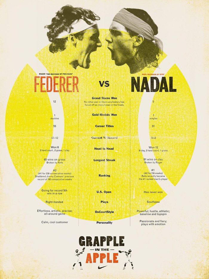
This infographic makes a strong visual impression. The bold colors and font consistency are inviting. The use of columns helps the viewer organize the information. This infographic presents a lot of data, but does not take advantage of the opportunity for sorting that data into charts or visual graphs. This lack of data visualization makes it difficult to decipher which information is most important–this is called visual hierarchy.

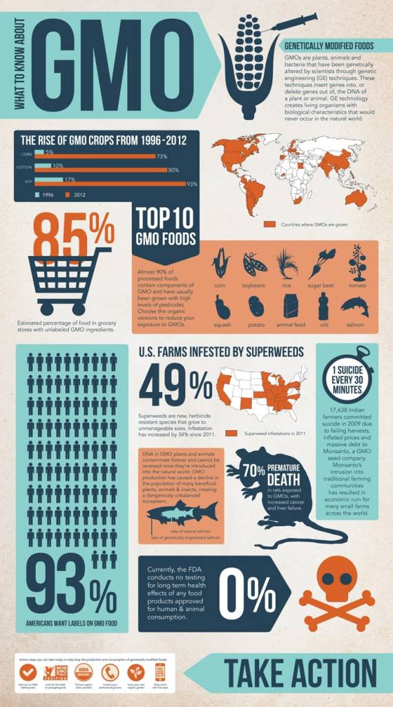
This infographic’s design utilizes visual hierarchy to suggest the order that a viewer should take in information. Though the color scheme is more muted the sections and mix of bold and standard lettering makes for a very digestible graphic. The use of charts and graphs are also important elements to this infographic’s overall efficacy.
This example incorporates many key elements of a high quality infographic. The color palette is cohesive, the typeface and font size are easy to read and the range of graphics help the viewer identify the overall message before even having read the data points.
While these infographics are just examples that can be found in a quick Google search, it can be beneficial to pay attention to infographics you might see in a regular day of media consumption. Take note of the information posts that come across your Instagram feed or the messaging done by different student organizations in your area. Developing awareness of the educational/persuasive messaging around you will strengthen your media literacy and help you contribute to a culture of informative digital communication.

Leave a comment